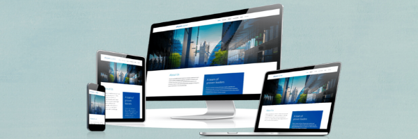
Responsive web design is a design approach that allows websites to display correctly on all devices and screen sizes by automatically adapting to the screen, whether it’s a desktop, laptop, tablet, or smartphone.
The ultimate goal of responsive design is to avoid unnecessary resizing, scrolling, zooming, or panning that occurs with sites that have not been optimized for different devices. It is often very difficult to navigate these sites, and it may even cost you potential customers who become frustrated with trying to figure out how to do something on your website.
Strategy 3 utilizes responsive web design in every website project we take on. Contact us to discuss how we can develop an effective website for you that will display beautifully on any device.